 |||
|||
An effective website is important for any business, but especially so for SaaS companies.

SaaS website design is crucial to get right because the business is completely online—meaning there’s no brick & mortar to rely on—and hands-off—meaning that ideally sales are made without an actual salesperson communicating back & forth with a potential customer.
SaaS is also a highly competitive space. It will grow more competitive as barrier to entry continues to drop.
Nowadays you don’t even need to know code to build a SaaS.
While there is no substitute for a genuinely useful product, your SaaS business can sink or thrive based largely on your website design. So how do you design an effective website for your business?
Below are some tips for an effective SaaS website design, along with examples. There’s no step by step instructions here. Rather, these are larger ideas to keep in mind during your first go at a website or redesign.
Just one quick note before we start.
Popular SaaS websites like Stripe are known for being highly engaging and beautiful. While that’s probably a plus in anyone’s book, beautiful is not the goal. Repeat after me: beautiful is not the goal.
Think of your website as a house. You invite people in, show them around, etc. The metaphor works. Now, when a house or website is considered beautiful, it’s usually a judgement made when the property is finished. Even when it’s 99% done, it will not look beautiful until it is complete.
Though it seems backwards, the decisions you make for the website before it’s even visualized will be what determines its appeal, not the final polish. A “beautiful” website—one that resonates and inspires not only your customers but your team—is a result of understanding your users’ needs, your own goals, and the medium of the web.
Also keep in mind that you don’t need to get it right on the first shot! Unlike houses, you can tweak and even rebuild your website until it works just as it should.
Here we go!
You’ve probably had this experience before. You visit a website, have no idea what they’re talking about, and close the website within 3 seconds. If you’re like me, you may not even remember the website—the name, the colors, or purpose—a few minutes after you close the tab and mosey on over to social media.
But maybe you’ve had this experience too: You visit a site, the headline directly reflects a problem you’ve been having, and you gladly scroll, all the way to the bottom, looking for a way to get the solution you’ve been searching for.
It goes without saying—it’s way better if you can elicit the second response from your audience rather than the first.
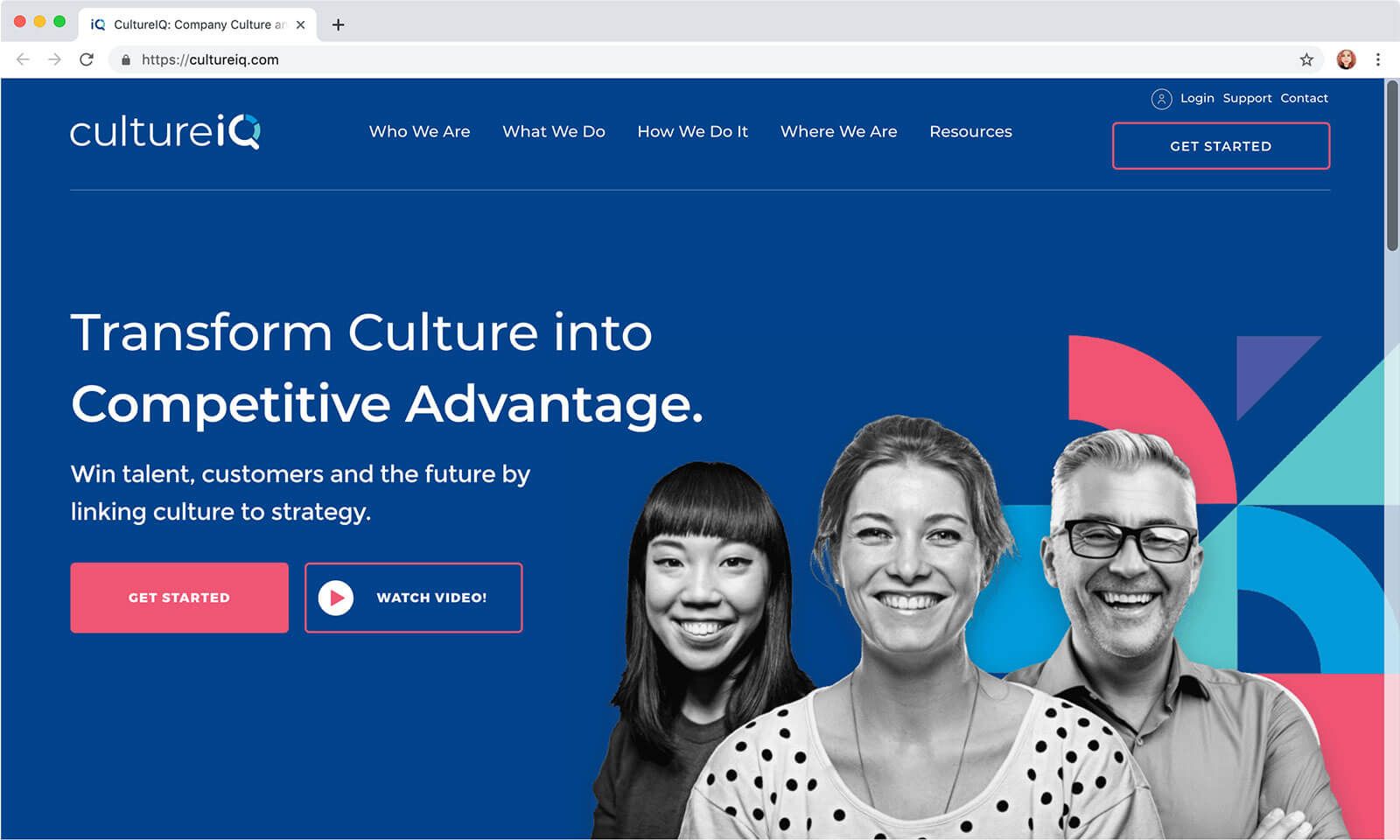
CultureIQ does this well. Notice how their headline would not appeal to just anybody, but only to a small segment of society with that exact desire.
They also have images of (real or potential?) customers, which is great because it drives home that, again, the product is not just for everybody but only for people looking to transform culture into competitive advantage—CEO types. For CEOs with that goal, this is the website for them.
Although it may feel like you are alienating people by making your website geared towards only one kind of person, that’s not the case. You alienate every person when you try to appeal to everyone. No one feels special or like your company was made just for people like them.
Your best bet for high conversions is to speak directly to your customer as if you were inside their head.
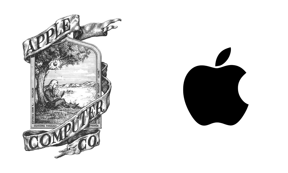
Have you noticed the best SaaS companies don’t try to WOW you with elaborate or intricate logos? The fact of the matter is, the best branding is simple and iconic. Although this isn’t a SaaS, a good comparison around tech companies is the old logo for Apple vs the current.
Unfortunately, many new companies try to cram their entire story into an overwhelming mark. But your brand is so much bigger than your logo. Your brand is communicated on every pixel of your website (whether you know it or not) including via…
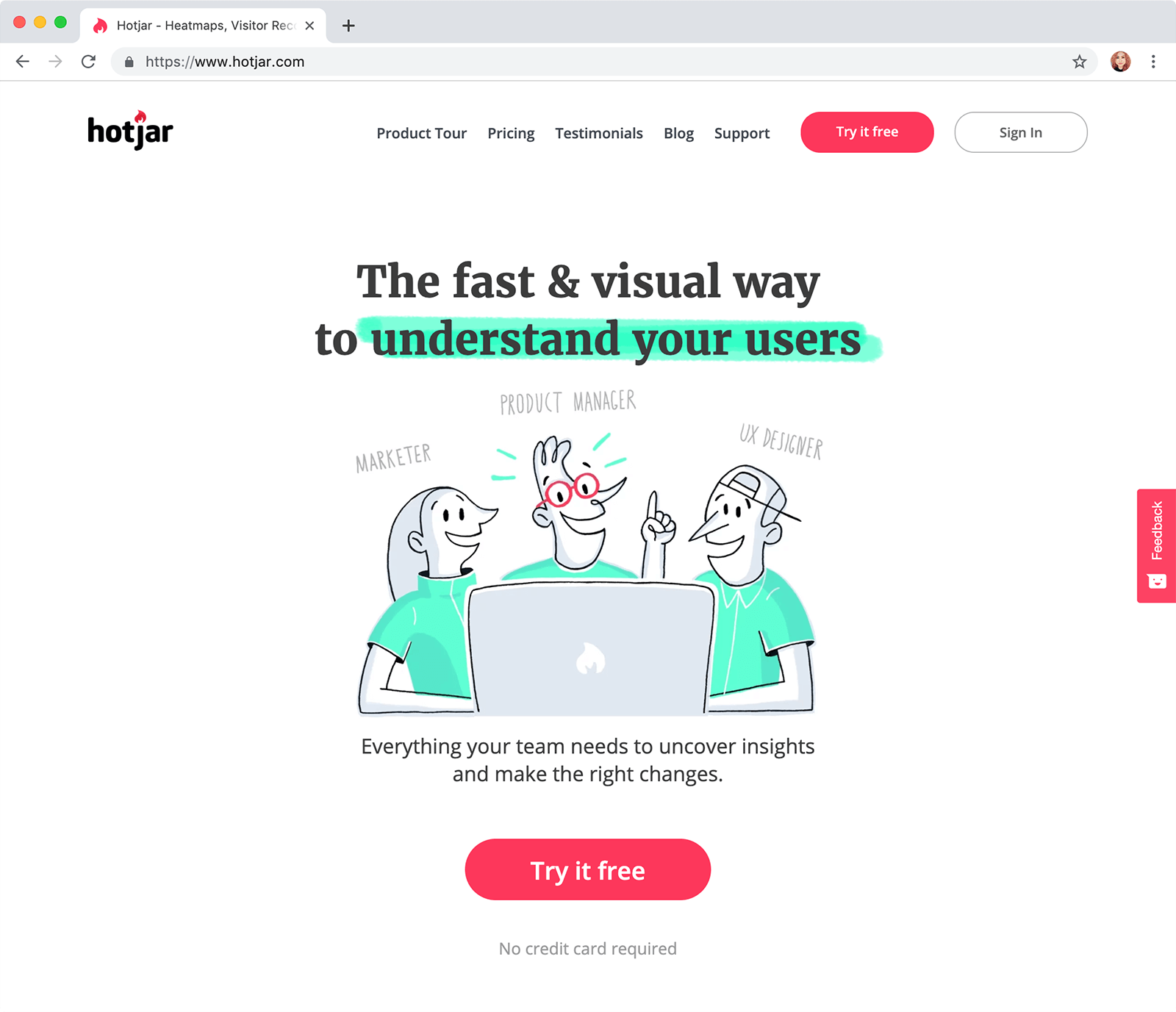
Hotjar creates an unforgettable visual impact with their brand by using all these elements together. It is effective without being overwhelming.
The content on your site should first and foremost help your visitor, wherever they are on their journey. You can help through whitepapers, blog posts, and other useful content.
Your website should be used for more than just a brochure of what your company does—it can be a highly engaging and persuasive sales tool.
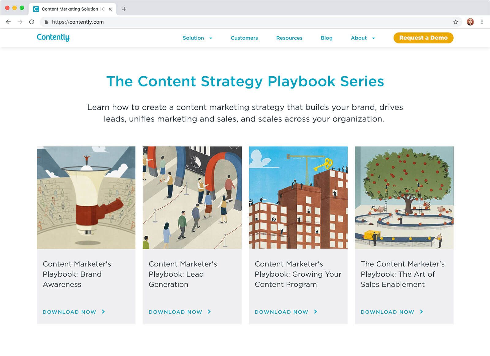
Contently provides “playbooks” for their potential customers. Nowadays, educational resources are something people expect from online businesses such as SaaS.
The numbers will vary from 0.5 to 8 seconds, but the general rule of thumb is that a website has a very short time to grab a visitor’s attention before they move on.
Because of this, it’s important that the landing view of your homepage makes an emotional impact.
You can achieve this by using images of real people, illustrations, or video. Visual elements like these work better than screenshots of your product because people can make a personal connection to them.
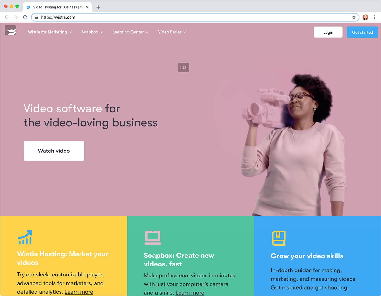
Wistia features an engaging looping animation in their “hero” (topmost section) to draw attention.
Social proof is evidence that other people have used your service and hey, they liked it alright. Social proof can take the form of…
Because SaaS can lack something of a personal factor, it’s vital to show your visitors that people just like them or entities they respect have given you the stamp of approval.
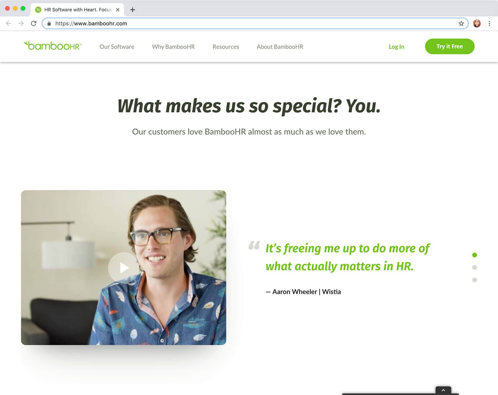
BambooHR shows testimonial videos from happy customers on their homepage.
Most people online scan text instead of reading it, or at least scan before they decide to really settle in and read. For this reason, your headers and subheaders are prime real estate.
Many websites fail to optimize their headers. Take a look at the headers on Pipefy’s website.
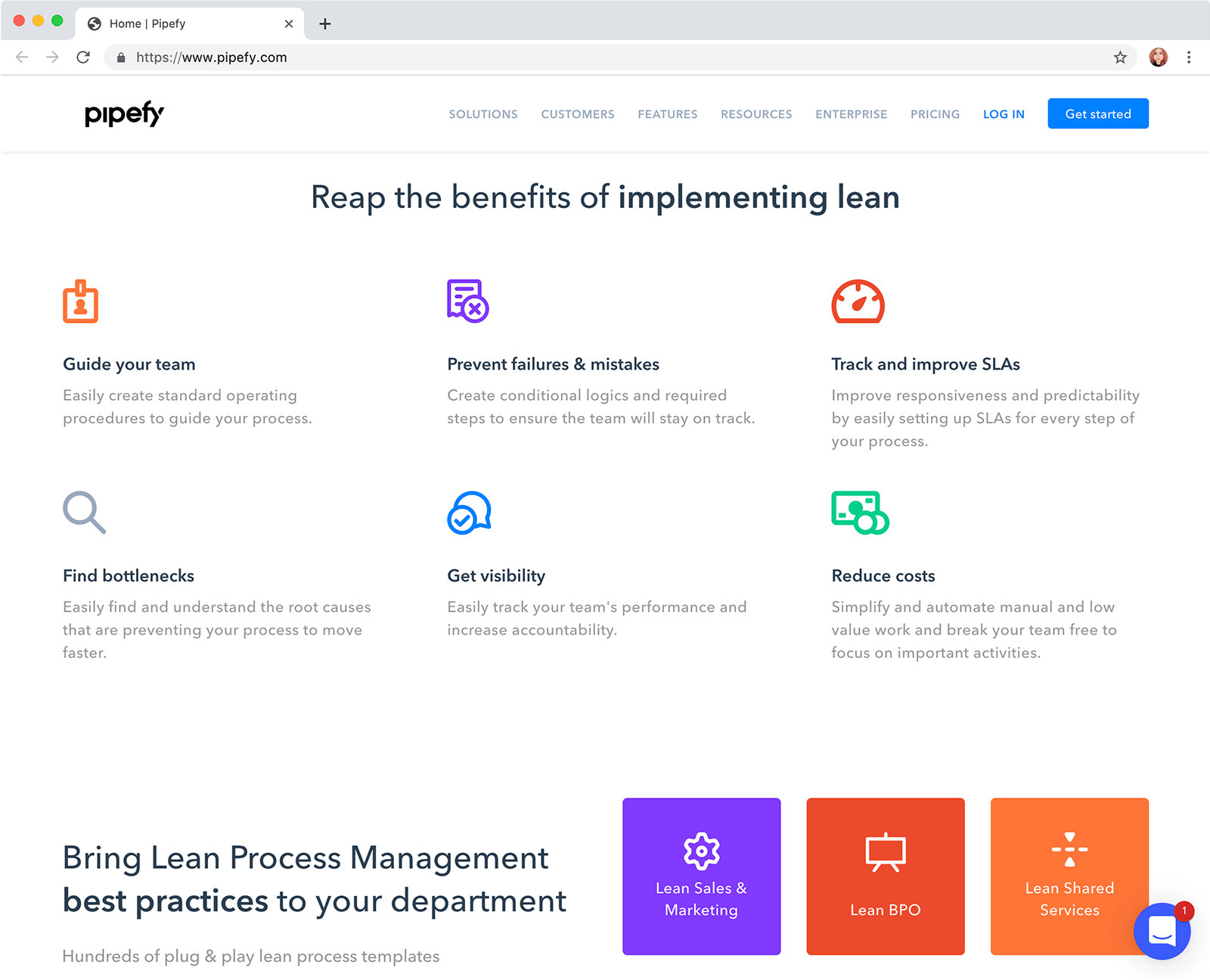
Now, they could have easily titled their first header “Features” and followed suit with simple labeling under each icon. Instead, they worked a benefit for the customer into each header and subheader. Every piece of text on this page is optimized to encourage action.
Consider your website’s headings and subheadings. Are they helpful to a customer in the process of deciding which service to sign up for, or are they generic?
Using colors effectively in your SaaS homepage involves limiting your color palette to 2–4 colors and assigning roles to each color.
For example, if orange is the color of your first primary call to action button, you should continue to use orange for call to actions, and only for calls to action.
Visually, it’s confusing if the same color is used for more than one purpose.
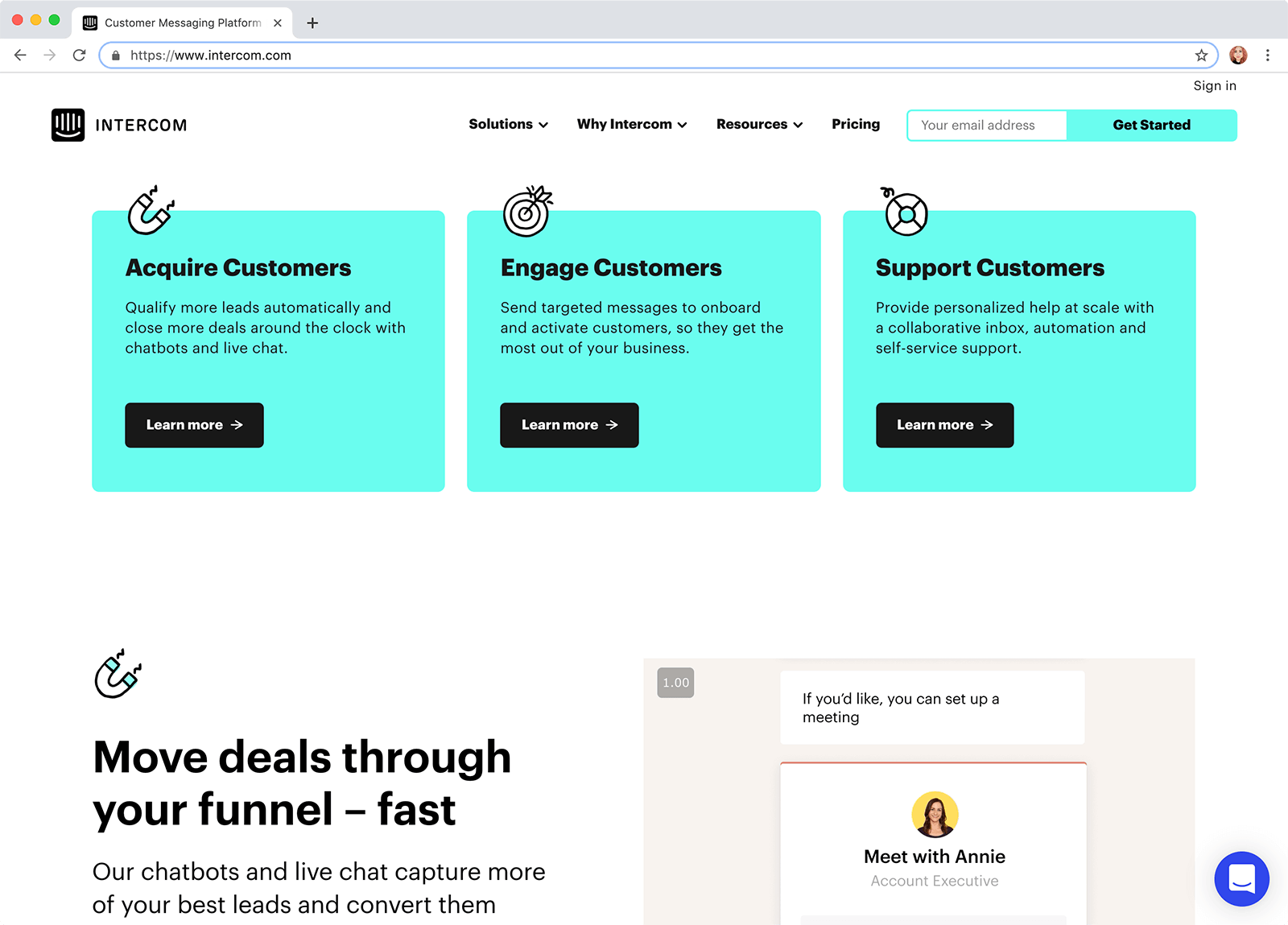
Intercom uses cyan and black largely for items they want you to take action on. Yellow, orange, and tan are used sparingly for visual effect.
While there may be multiple buttons on your website, ideally the primary action you wish visitors to take should 1) always be visible and 2) stay the same.
For example, if your main call to action is “Try the Free Demo,” every button with the same prominence (size, color, etc) should also offer a free demo—not an email link, learn more link, or about us link.
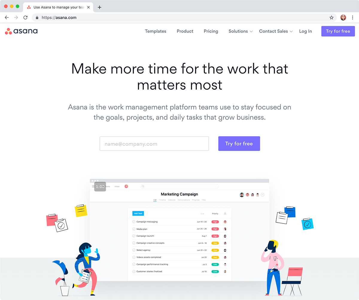
Asana has multiple calls to action throughout their homepage but all point to the same destination: a free trial of the service.
For many types of B2B SaaS companies, the desktop or laptop version of their website is most important. This can be because their target customer normally browses for business solutions while at work, on their desktop or laptop. (You may want to check your own site statistics to see whether that’s the case for you.)
Regardless, the mobile version of your website is always important. Whether it’s somebody on the go checking out your service or a tablet with your website passed around a conference table, your mobile website should represent you well.
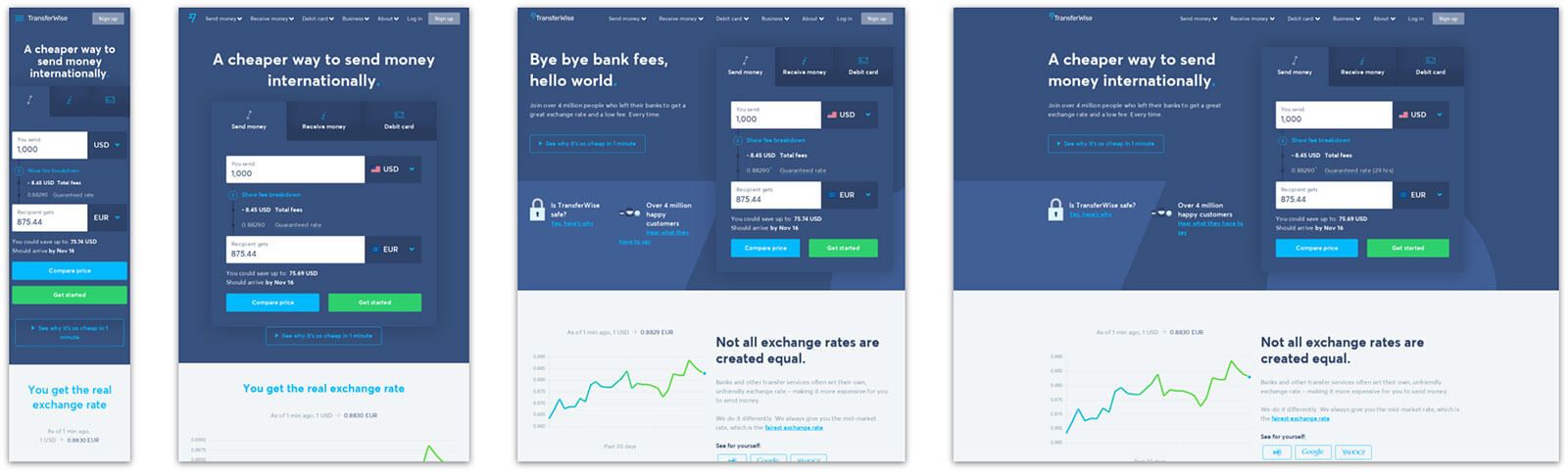
TransferWise was featured on mediaqueri.es (“media queries” being a reference to responsive web development) for their graceful device-agnostic website.
Slow-loading websites are equal parts forgettable and frustrating. Simply put, slow websites are bad for business. They make for unhappy customers and potential customers. Optimize your website for performance and watch how your page view count and time spent on site goes up, while your bounce rate drops.
Navigation, or your header menu, is important because it guides your visitors through your website. Navigation should consistent, easy to see, and succinct.
Although I mentioned page view count as a positive metric above, your navigation menu acts much like a concierge, so efficiency is key. Fewer interactions are better in this case. Every page of your website is ideally one or two clicks away at all times.
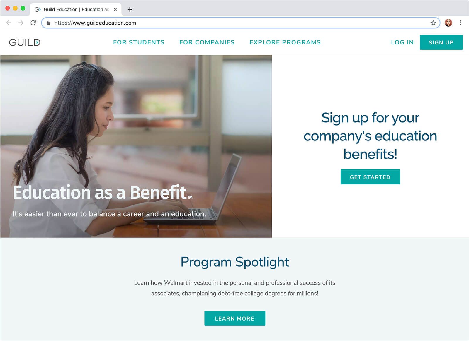
Besides their account links (such as Sign Up), Guild’s menu is limited to 3 links—one for each of their customer types plus a link to explore all solutions. This is a great example of putting your visitors and their needs first.
This approach won’t work for everyone—for example, SaaS that make the majority of their conversions on a Pricing page—but the point is that your header menu should be well though-out. Avoid copying your competitors or other companies and really consider what would work best in your unique case.
For many people, mostly younger people, the culture behind companies they support is of the utmost importance. As transparency becomes more of a valued part of doing business, this will only become a larger part of what it means to appeal to your customer.
An effective method for showing company culture is to communicate your company values in terms of the “bigger picture” or how you want to impact society.
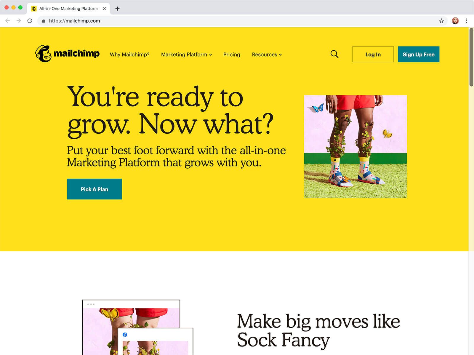
MailChimp makes their mission as a company crystal clear.
This shouldn’t be just talk though, and for MailChimp, it isn’t. They recently (at the time of writing) opened their own studio for producing shows about their customers’ journeys. Talk about dedication to the mission.
Going out of the way to do things that are not related to your business model but to your purpose as a company shows customers you’re serious about being a part of their lives.
For most of your customers, what converts them isn’t your features or even company mission. In fact, it’s nothing you have direct control over. It’s their imagination. It’s how they see themselves changed after using your product.
One of the most effective ways to increase your conversion rate is to encourage this kind of visualization within your homepage.
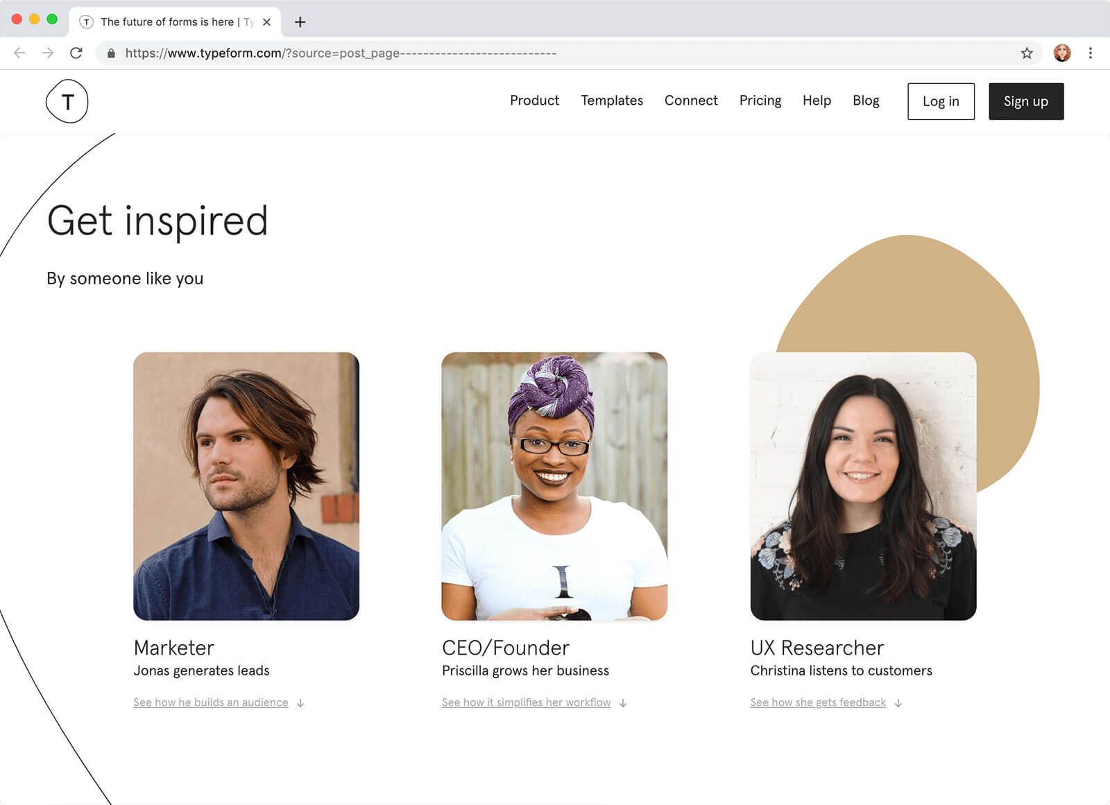
Typeform, under the header “Get Inspired,” features stories from their customers meant to evoke a picture in their visitors’ mind of what is possible if the visitor signs up for their product.
One of the most common fears for consumers around signing up for a SaaS is whether the SaaS company is active and thriving. If a visitor sees no sign of your website being updated in the last year, you can be sure it will set off alarm bells in their head.
Customers want to know not only that their provider can help them through timely customer support but that the product is successful (aka profitable) and won’t shut down on them any time soon.
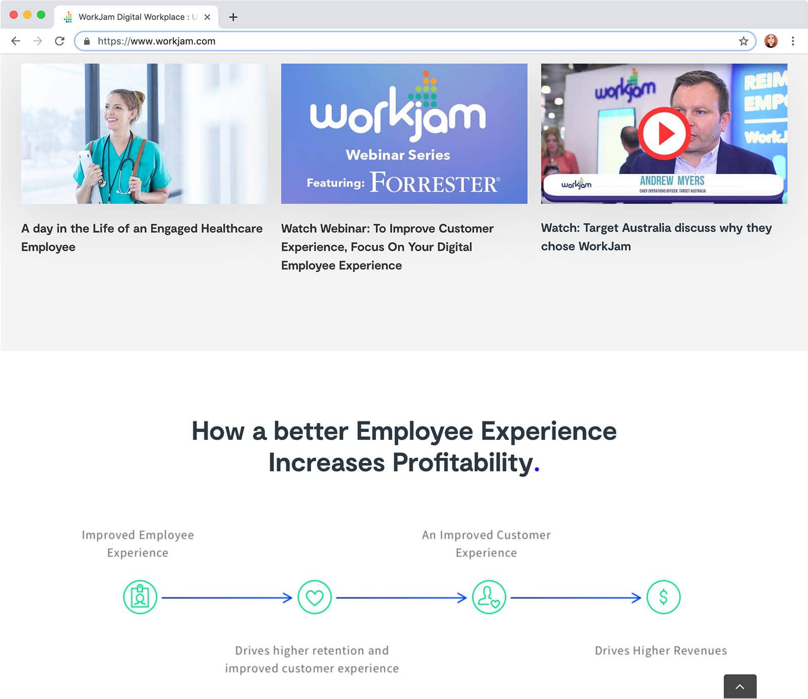
WorkJam shows the latest happenings of the company on their homepage. This lets visitors know the company is alive and well.
Often tucked away on a “Features” or “Tour” page, walkthroughs are one of the most direct ways people can picture themselves using your product.
Walkthroughs can take many forms. As mentioned above, a walkthrough can be simple screenshots of your product. It can be illustrations, animations, or before/after shots.
The important thing is that a visitor should be able to visualize what your product does exactly, broken down step by step.
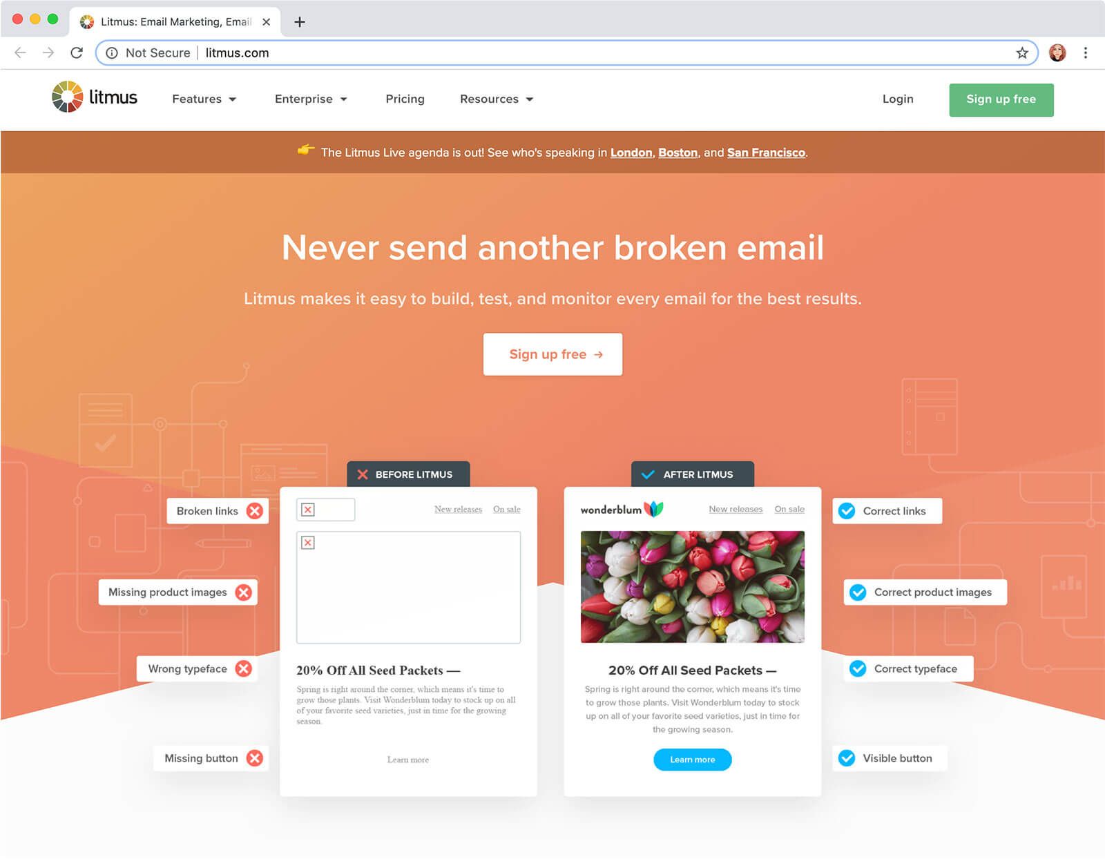
Litmus shows a stylized before and after shot on their homepage’s top section.
Picture what your potential customer is thinking about when they land on your homepage—probably not anything about your product’s features. More likely a problem or two they’ve had lately and believe your product may be able to help with.
The problem should come first. Generally, your landing page can follow the framework created by copywriters (advertising writers) called PAS. It stands for Problem, Agitation, Solution.
First acknowledge your visitor’s problems. Second, agitate or let them know you see exactly how this problem is affecting their life. Then, present your solution.
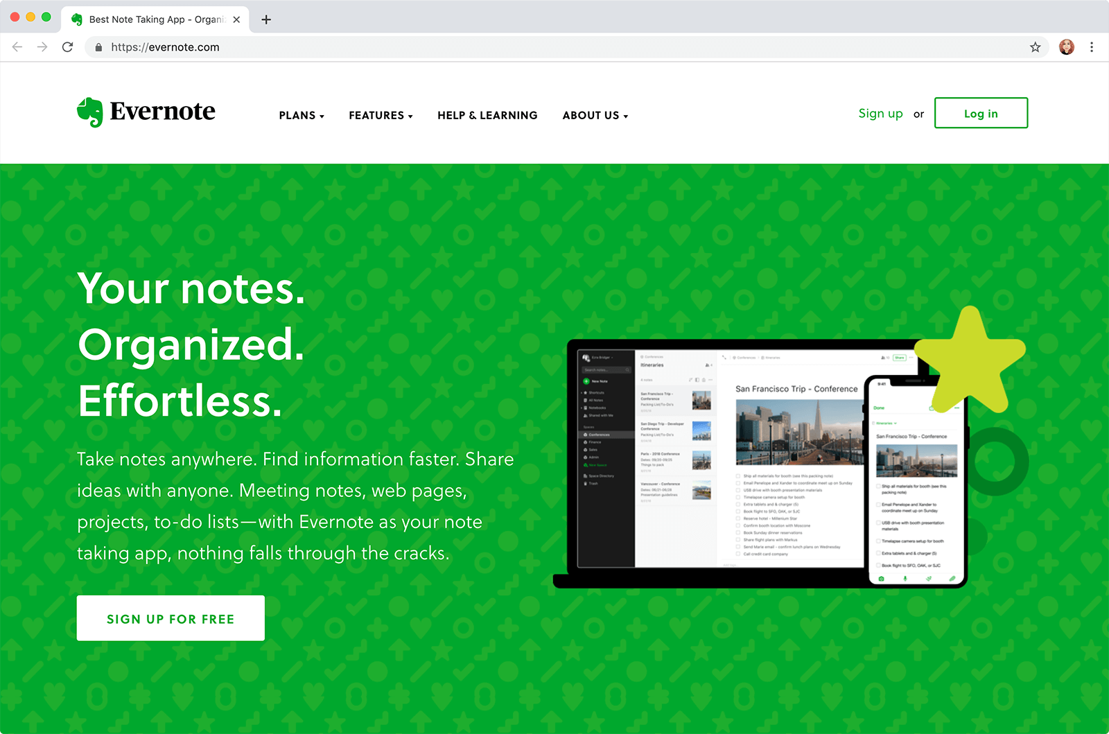
Evernote doesn’t tout itself as the end all & be all of note-taking apps, though that is certainly their goal. They open instead with an acknowledgement of the visitor’s problems; namely, disorganized difficult note storage.
In this case, the PAS has a positive tilt—affirmative, constructive, “good” words are used to illustrate the problem. In other cases, the problem may be spelled out as bluntly as, “You are losing money right now.”
There’s something to be said for loss aversion (the idea that we will work harder to avoid negative consequences than to gain positive change) but the method you use depends on your audience, marketing methods (where people are coming from), and your company values.

Hi, I’m Diana Lopez! I’m a freelance web designer and developer who works with startups and small businesses. I create memorable & effective websites and brand identities. Interested in learning more? See my portfolio at pixelswithin.com →